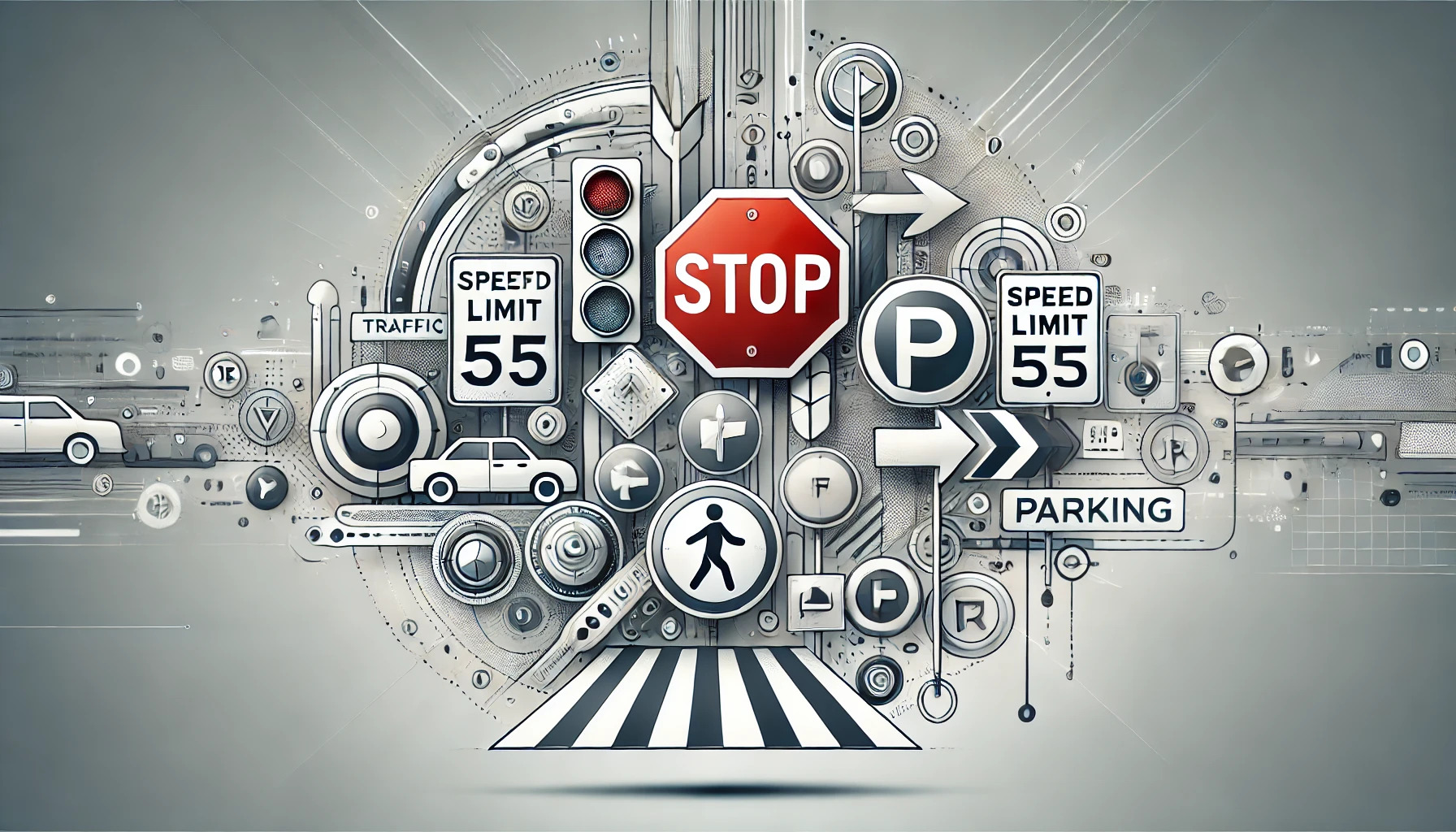
Traffic signs and symbols are essential for road safety and smooth traffic flow. They provide vital information and directions to drivers and pedestrians alike, ensuring that everyone is aware of their surroundings and can make safe decisions on the road.
Traffic symbols use different colors and shapes for various meanings. For instance, red signs often mean stop or prohibit certain actions, while green signs might indicate permitted movements or directions. Learning these distinctions can help drivers respond quickly and correctly to the signs they encounter.
Recognizing and interpreting traffic symbols is crucial for anyone using the roads. Whether it’s colors indicating caution or shapes guiding specific actions, the ability to quickly understand these signs can make a big difference in traffic safety. This article will explore different traffic symbols and their meanings, enhancing both driving skills and road awareness.
Understanding Traffic Symbols
Traffic symbols play a crucial role in ensuring road safety and efficient transportation. These symbols convey important information through shapes, colors, and designs. Understanding their history, significance, and the logic behind their colors and shapes helps drivers make informed decisions.
History of Traffic Symbols
Traffic symbols have evolved greatly over the years. Early road signs were simple and made of wood or stone, often displaying basic messages like directions or distances. With the advent of automobiles, there was a growing need for standardized symbols to manage increased traffic flow.
In 1908, an international conference in Paris marked the first step towards uniform traffic signs. By the mid-20th century, many countries adopted comprehensive symbols. These evolved into the signs we recognize today, incorporating symbols that transcend language barriers. The history reflects a journey from basic, localized markers to intricate, globally understood visuals.
Importance of Traffic Symbols
Traffic symbols are vital for road safety and smooth movement. They guide drivers on permissible actions and warn of potential hazards. Ignoring these symbols can lead to accidents or traffic violations.
For example, stop signs ensure drivers come to a full stop, reducing the risk of collisions. Yield signs require drivers to give way, preventing conflicts at intersections. Symbols also help regulate speed and inform drivers of upcoming conditions, like sharp turns or school zones. The importance of traffic symbols lies in their ability to clearly communicate rules and warnings to all road users.
Color Coding and Shapes
Color and shape are essential in traffic symbol recognition. Each color and shape conveys specific meanings, aiding drivers in quick identification. Red signs, like stop or yield, indicate prohibitive actions. Yellow signs are typically warning signs, alerting drivers to potential hazards.
Shapes also play a role. Triangles often indicate caution or yield. Rectangles are used for informational or regulatory messages like speed limits. Circular signs usually signify prohibitive actions. The combination of color and shape allows for quick understanding and immediate action. Traffic symbols use a universal language of colors and shapes that ensures all drivers comprehend the message at a glance.
Decoding Functional Symbols
Functional symbols help people navigate various environments, from public spaces to digital interfaces. Understanding these symbols improves communication and efficiency.
Symbols in Public Spaces
Public spaces are filled with symbols that guide and inform people. Traffic signs, such as stop signs and arrows, help drivers understand road rules. These symbols use colors and shapes to convey messages quickly, like red for stopping and green for going.
Facilities, such as restrooms, also use symbols to assist people. They often feature simple images that indicate gender or accessibility options, making them understandable without text.
In parking lots, symbols indicate areas for specific vehicles or people, like handicapped spots. Using clear and consistent symbols ensures everyone can navigate efficiently, enhancing their safety and experience.
Workplace Symbolic Language
In the workplace, symbols communicate instructions and warnings. Safety signs, for example, use images to indicate hazards—like a lightning bolt for electrical danger. They help avoid accidents by quickly informing employees of risks.
Equipment labels show how machines should be operated. Icons on machinery may indicate an on/off switch or demonstrate parts that require caution.
Emergency symbols, like those showing exits or fire alarm locations, are vital for quick evacuation. Consistent and clear workplace symbols improve safety and productivity, ensuring that employees receive instructions efficiently and are prepared for emergencies.
Digital Interface Icons
Digital interfaces rely heavily on icons to facilitate user interaction. On websites and apps, icons like magnifying glasses for search or shopping carts for purchases are commonplace. These icons streamline navigation by providing visual cues without needing explanatory text.
Icons often communicate status updates. For instance, a bell may indicate notifications, while a red dot signals something new or urgent. Settings cogwheels provide easy access to customization options.
In messaging apps, icons such as smileys or gifs enable emotional expression. This visual language enriches digital communication, making interactions more intuitive and engaging, as users quickly recognize and understand each icon’s function.
Common Traffic Symbols and Their Meanings
Traffic symbols are essential for keeping roads safe and organized. They help drivers understand rules and ensure safety for everyone, including pedestrians and cyclists.
Stop and Yield Signs
Stop signs, marked with a clear red and white octagon, tell drivers to come to a complete stop before moving ahead. This sign helps control traffic flow at intersections and prevents accidents. Drivers must look for other vehicles and pedestrians, ensuring it is safe to proceed.
Yield signs are triangular with a red border and a white center. These instruct drivers to slow down and give the right-of-way to traffic on the road they are entering. Yield signs are crucial at merging lanes and entrances to roundabouts, reducing confusion and collisions.
Speed Limit and Traffic Direction
Speed limit signs display the maximum safe speed for a section of road. These rectangular signs, usually with a white background and black numbers, help reduce accidents and promote a smooth flow of traffic. Drivers must pay attention to these signs, especially in areas prone to traffic congestion or near schools.
Traffic direction signs guide movements, often using arrows or lane indications. They show which lanes are for turning, merging, or going straight. These signs help drivers choose the correct lane before they reach their destination, reducing last-minute lane changes.
Pedestrian and Bicycle Signs
Pedestrian signs, often yellow or fluorescent yellow-green, alert drivers to areas where people frequently cross the street. This includes crosswalks and school zones. These signs are vital for the safety of pedestrians, especially children and seniors who might walk slower.
Bicycle signs indicate bike routes or lanes, promoting safe sharing of the road. Green or blue backgrounds with white symbols are common. With the rise in cycling, these signs help drivers and cyclists coexist safely. They also provide directions for cyclists to follow specialized paths or reach certain destinations, creating a more bike-friendly environment.
Significant Functional Symbols
Functional symbols are important in everyday life because they help people understand critical information quickly. These symbols are found in many places, including on roads, public buildings, and informational signs. They play key roles by providing details about emergencies, accessibility, and general information.
Emergency Services Symbols
Emergency services symbols are crucial for guiding people in urgent situations. Symbols like the red cross represent medical help, while a fire extinguisher symbol indicates firefighting equipment. These symbols need to be instantly recognizable so people can take quick action when needed. They often use bright colors like red or orange, which are easy to spot.
Examples include:
- Red Cross: Medical aid.
- Fire Extinguisher: Location of firefighting equipment.
- Exit Signs: Shows emergency exit routes.
These symbols are designed to minimize confusion and help people respond effectively during an emergency.
Accessibility Symbols
Symbols for accessibility mark areas and facilities that are designed for people with disabilities. The wheelchair symbol is widely recognized and indicates features like ramps, parking spaces, or restrooms that are accessible. These symbols promote inclusivity and are often found in public spaces.
Key Accessibility Symbols:
- Wheelchair Symbol: Access for people with mobility issues.
- Hearing Loop Symbols: Facilities equipped with hearing assistance.
- Vision Impairment Icons: Areas that are safe for those with vision impairments.
These make it easier for people with disabilities to navigate public areas independently.
Informational Symbols
Informational symbols help people find their way, get guidance, and learn important details about a location. They can include symbols for restrooms, information centers, or Wi-Fi zones. Often found in airports, malls, and public buildings, these symbols enhance people’s experiences by providing useful information.
Common Informational Symbols:
- Wi-Fi Symbol: Shows where wireless internet is available.
- Restroom Icons: Indicates restroom locations.
- Information Center Signs: Points to information desks for further assistance.
Informational symbols make it easier for everyone to find what they need efficiently.
International Symbol Variations
Traffic and functional symbols can vary across different countries. These differences can influence how easily drivers and pedestrians interpret signs in international contexts. It’s important to recognize these variations to enhance global travel safety.
Comparing Traffic Symbols Globally
Traffic signs have unique characteristics depending on the country. For example, a stop sign in the United States is octagonal with a red background, whereas other countries may use different shapes or colors.
Common Traffic Symbols:
- Stop Sign
- No Entry
- Yield
Even though these symbols aim to communicate the same message, their presentation might differ. Understanding these differences is crucial for travelers who may not speak the local language but rely on symbols for orientation.
International Functional Symbols
Functional symbols, like bathroom or information signs, also show regional variations. These signs use images to convey essential services without relying on text. In some countries, symbols might integrate cultural elements to convey their meaning.
Examples of Functional Symbols:
- Restroom Icons: Usually show a man or woman, but designs can vary.
- Wi-Fi Signs: Often include the familiar signal waves, though styles may differ.
- Information Booths: Typically marked with an “i,” but design features might change.
Being familiar with these types of symbols helps in quickly understanding directions or services available, which is vital when language barriers exist.
Symbol Design and Placement Considerations
When designing symbols, clarity is crucial to ensure quick recognition and understanding. Placement also plays an important role in making sure these symbols are easily noticed and interpreted. These factors work together to create an effective communication tool through symbols.
Design Principles for Clarity
Symbol design should prioritize simplicity and distinctiveness. Simple designs help in quickly conveying a message without confusion. Avoiding intricate details ensures that the symbol remains recognizable even in a quick glance. It is also important to use colors that contrast well to differentiate the symbol from its background, enhancing visibility.
Symbols should also be intuitive and culturally sensitive. For example, a checkmark often indicates completion, but this meaning may vary among different cultures. Adapting symbols to local contexts can enhance user understanding. You might find these considerations echoed in discussions about cross-cultural symbol variability.
Strategic Placement for Visibility
The placement of symbols significantly impacts their effectiveness. Positioning symbols at eye level ensures they are immediately noticed by the intended audience. For road symbols, placing them well ahead of any decision points allows enough time for drivers to react. The diamond shape, often used for decision points in flowcharts, demonstrates the need for visibility in choice-making scenarios and can be explored in more depth in the flowchart symbols guide.
Environment plays a role in placement decisions. In noisy settings, symbols should be placed prominently within the visual field, free from obstructions. This strategic visibility helps in guiding actions and enhancing understanding without requiring additional explanations.